Monday, May 28, 2012

Spots and Horse Racing

Sorrel
6" x 6"
watercolor

In the Pack
6" x 9"
watercolor
These first two paintings were done for the DPW challenge Seeing Double.  I had to use the same reference but change up the size and composition of the piece.  So I chose a photo I took of some Quarter Horse racers and zeroed in on the pretty sorrel on the left.  I completed the large piece first.  I think I tried to put too much detail in the group painting.  I should have either left out some stuff or painted it bigger.  I really like how the headshot turned out though. 

Lonely Cheetah
6" x 6"
watercolor
I just love cheetahs.  They are one of my favorite wild animals.  They are so graceful and somewhat elusive.  I think it is interesting how they are normally alone.  I think it would be a sad life.  I used the reverse side of my watercolor paper because it was much smoother and I wanted to see how it would work out.  I can't really decide if I like painting on the smooth side better or not. 
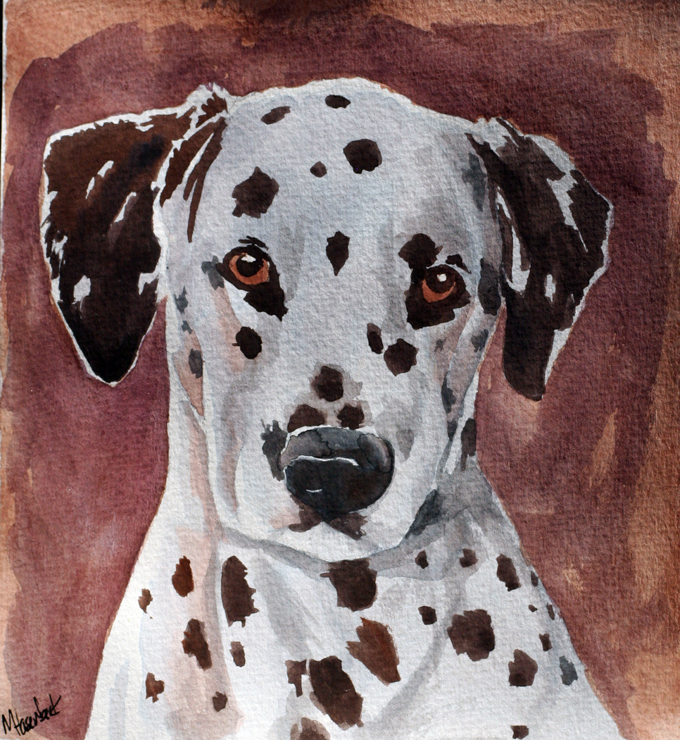
Polka Spots
5.5" x 5"
If there is anything I like drawing/painting as much as horses it would have to be dogs.  I couldn't resist those spots and puppy-dog eyes.   I really enjoyed using a limited palette on this one.  Made things much simpler for me. 

Saturday, May 19, 2012

What Yellow Means to Me

"Mellow Yellow"
6" x 6"
Watercolor
This is the story of a special little palomino filly I met a couple years ago.  She came to the barn for training and to participate in some nutrition studies.  She had no name and she had only been handled a few times.  I spent the first two weeks with her just teaching her to be caught and let me put a halter on.  She was one of the most fearful horses I have ever worked with.  At the end of 4 months I was able to ride her around like a dream.  She never bucked or misbehaved.  People around the barn started calling her "Mellow Yellow" and it stuck.  She was a special little filly and I wish I could see where she is now. 

This is my entry into DPW's "the yellow challenge".  When I think of yellow I think of this amazing little palomino filly.  This was painted from the only photo I ever took of her the first day I met her.  I wish I had taken more. 

Shoe Doodling

Toms
Ball-point fabric pen

Haven't posted in a while because this project ended up taking a lot longer than I thought it would.  I have had these white Toms shoes for a while now, but they got a few stains on them and I didn't want to wear them.  Then I saw that many people customize them so I thought I'd give it a shot.  I found a ball-point fabric pen at the store that has permanent, waterproof ink.  Unfortunately I ended up needing to go back to the store to buy 3 more because this project really drained the ink out of them fast!! I wanted them to have a nautical theme, but still have a strong design aspect and this is what I came up with.  Took me almost an entire day to finish them, but it's totally worth it when I get to wear my art around everyday :)  Still can't decide if I want to add some color to them or not.  I was thinking about maybe just using one accent color, but I may just leave them like this since black/white matches almost everything. 

Monday, May 14, 2012

Black Friesian

Keegan
8.5" x 7"
black and white charcoal on brown paper
Here is something a little different from me.  This is actually more like the drawings I normally produce.  I prefer drawing to painting because I have so much more control.  It was difficult to leave this alone and not keep messing with it.  The beauty of charcoal is when it is very loose and sketchy.  This attractive Friesian horse was just screaming to be drawn.  It was very enjoyable to draw this because I didn't have to worry over my color choices the whole time or stress over a possible watercolor-mess-up.  I would consider this more of a sketch than a finished drawing, but I think I like it that way.  I want to experiment more with this style and colored paper. 

Saturday, May 12, 2012

Chomping at the Bit

"Chomping at the Bit"
5.5" x 9"
Watercolor
Had a blast painting this horse.  Referenced from my own photograph at one of the local Quarter horse races.  I don't know his name (or anything about him really).  I love going to the races just to take pictures.  I probably have hundreds of them saved away in a file. 

Watercolors are still not cooperating with me in any way, but at least I am learning.  This might be a painting that I come back to and redo in a year or so and see if I have improved.  Watercolor has such a steep learning curve. 

Friday, May 11, 2012

Green Porsche

Green Porsche
5.5" x 7.5"
Watercolor
I got to photograph this cute little speeder at a Porsche club racing event a couple years ago.  Of course, I see all my errors now that I am done with it, but I guess that is the downfall of paintings done quickly in one sitting.  I want to paint more cars now.  I am not sure why it is so much grainier on my computer screen.  In person this painting is much smoother. 

Paint Horses

Paint Horse Sketches
Each is 4.5" x 6"
Watercolor
I am really enjoying these tiny studies in watercolor.  It is such a great way to really practice techniques and explore without worrying so much about the drawing itself.  There was actually a fifth one in this set but I painted a better one on the opposite side.  I think instead of stressing myself out to try and paint something new everyday that I can just do a little set like this every week.  I did these on some 90lb watercolor paper that I bought on super clearance (only $2 for 26 sheets).  I had never used them before because I could see the lack of quality just by glancing at it, but I was extremely pleased when I actually started painting on it for these little practice paintings.  This is probably the only 90lb paper I have ever gotten along with. 

Wednesday, May 9, 2012

Tour of the White House

White House Corridor
9.5" x  8"
Watercolor
I have actually been drawing quite a bit lately, but I loaned out my camera so I had no way of showing them all to you until now.  This is a painting of a corridor in the White House.  I loved how the light cast shadows and light on the ceiling.  I originally had a much bigger picture in mind, but it was too difficult and cluttered so I had to shrink my vision.  I hate to blame the materials, but I really struggled to paint on this paper.  It is 140lb cold press from a watercolor sketchbook I purchased years ago and then forgot about.  I felt like I was painting on cardboard.  I couldn't get the paint to flow or mix and everything looked significantly more chalky than any previous painting.  I will probably give the paper another chance, but if I get similar results then I will probably just use it for sketching.  Overall, this was one of the most difficult paintings I have done.  The perspective was very skewed based on the way the photo was taken (it almost looked like it was taken with a fisheye lens) so I couldn't even rely on my ruler. 

Thursday, May 3, 2012

Architectural Drawing

Afternoon Light
10" x 6.5"
Watercolor Pen and Ink

This is not something that you will see from me often.  Structures and straight lines are just not my thing.  That being said, I have always loved looking at architectural drawings.  The lineart is always my favorite, but the color just adds that "extra something" that it needs.  This was my attempt to draw something in a similar style.  I tried to stick to a pretty limited color palette. This looks a bit darker than the original unfortunately... the paper was white but it looks blue.